
css如何制作圆
时间:2021-04-09
来源:互联网
标签:
今天PHP爱好者给大家带来在css中,可以利用border-radius属性来制作圆;border-radius属性可以为元素添加圆角边框,只需要给宽高相同的正方形元素的设置“border-radius: 100%;”样式即可。希望对大家有所帮助。

本教程操作环境:windows7系统、CSS3&&HTML5版、Dell G3电脑。
p+Css制作四分之一圆主要是使用Css3.0中的border-radius这个圆角隐藏属性.利用这一属性,我们可以画圆,画半圆,四分之三圆,四分之一圆等.以后我会更新……
如何使用border-radius属性,下面是border-radius属性最基本的使用方法:
.round {
    border-radius: 5px; /* 所有角都使用半径为5px的圆角,此属性为CSS3标准属性 */
    -moz-border-radius: 5px; /* Mozilla浏览器的私有属性 */
    -webkit-border-radius: 5px; /* Webkit浏览器的私有属性 */
    border-radius: 5px 4px 3px 2px; /* 四个半径值分别是左上角、右上角、右下角和左下角 */
}
1、用border-radius画圆:
#circle {
    width: 200px;
    height: 200px;
    background-color: #a72525;
    -webkit-border-radius: 100px;
    /*-webkit-border-radius: 100%;*/
}
仔细想想,一个正方形(200*200),里面最大的圆是的半径是:100.

2.空心圆代码:空心圆其实就是只有边框,空心部分填上其他颜色:
#circle {
    width: 200px;
    height: 200px;
    background-color: #efefef; /* Can be set to transparent */
    border: 3px #a72525 solid;
    -webkit-border-radius: 100px;
}

同理虚线圆代码:
#circle {
    width: 200px;
    height: 200px;
    background-color: #efefef; /* Can be set to transparent */
    border: 3px #a72525 dashed;
    -webkit-border-radius: 100px 100px 100px 100px;
}

3.半圆和四分之一圆代码:
#quartercircle {
    width: 200px;
    height: 200px;
    background-color: #a72525;
    -webkit-border-radius: 200px 0 0 0;
}

<!doctype html>
<html>
 <head>
  <meta charset="UTF-8">
  <meta name="Generator" content="EditPlus®">
  <meta name="Author" content="">
  <meta name="Keywords" content="">
  <meta name="Description" content="">
  <title>Document</title>
  <style type="text/css">
      #quartercircle{
        width: 200px;
        height: 200px;
        background-color: #ffffaa;
        border-radius:0 0 0 200px;
        -webkit-border-radius: 0 0 0 200px;
        -moz-border-radius: 0 0 0 200px;
        -ms-border-radius: 0 0 0 200px;
        -o-border-radius: 0 0 0 200px;
        }
     #quartercircle .dianxuan{
        font-family:Arial;
        color:gray;
        font-size:25px;
        padding-top: 55px;
        padding-left: 90px;
        transform:rotate(32deg);
        -ms-transform:rotate(32deg); /* Internet Explorer */
        -moz-transform:rotate(32deg); /* Firefox */
        -webkit-transform:rotate(32deg); /* Safari 和 Chrome */
        -o-transform:rotate(32deg); /* Opera */
     }
  </style>
 </head>
 <body>
  <div id="quartercircle">
  <div>点选</div>
  </div>
 </body>
</html>

解释:
-moz(例如 -moz-border-radius)用于Firefox
-webkit(例如:-webkit-border-radius)用于Safari和Chrome
其中border-radius各个浏览器支持情况如表:
Firefox(2、3+) | √ |
Google Chrome(1.0.154+…) | √ |
Google Chrome(2.0.156+…) | √ |
Safari(3.2.1+ windows) | √ |
Internet Explorer(IE7, IE8) | × |
Opera 9.6 | × |
以上就是css如何制作圆的详细内容,更多请关注php爱好者其它相关文章!
-
 什么是无理数 常见的无理数有哪些 无理数和有理数的区别 时间:2025-11-19
 -
 Linux中软连接和硬链接的区别、优缺点和应用场景等 时间:2025-11-19
 -
 什么是Hypervisor Hypervisor虚拟机监控程序详解 时间:2025-11-19
 -
 numeric是什么数据类型 decimal和numeric的区别 时间:2025-11-19
 -
 Java中public class和class的区别 时间:2025-11-19
 -
 Android中Activity跳转的两种实现方法 时间:2025-11-19
今日更新
-
 明日之后回归需要多少天-明日回归机制天数详细
阅读:18
-
 上梗是什么梗?揭秘网络热词背后的爆笑真相,看完秒懂!
阅读:18
-
 重返未来:1999新角色灰调蓝-角色技能是什么前瞻
阅读:18
-
 鸣潮×CoCo联动什么时候开始-联动开始时间
阅读:18
-
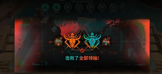 明日方舟卫戍协议-卫戍奇迹盟约怎么叠层
阅读:18
-
 学信网官方登录入口-学信网2025最新版登录通道
阅读:18
-
 千机阵流派选择推荐-千机阵有哪些流派值得玩
阅读:18
-
 wechat网页版官方登录入口 wechat网页版一键登录
阅读:18
-
 币安风控触发原因解析:API使用不当如何规避风险
阅读:18
-
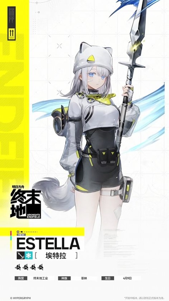 明日方舟:终末地干员情报公开-埃特拉技能
阅读:18