
css如何让高度自适应
时间:2021-08-09
来源:互联网
标签:
今天PHP爱好者给大家带来css让高度自适应的方法:1、给html元素设置“height:100%;display:table;”样式,给body元素设置“display:table-cell;height:100%;”样式即可。2、使用flex布局。希望对大家有所帮助。
本教程操作环境:windows7系统、CSS3&&HTML5版、Dell G3电脑。
在写css静态页面的时候让Html的高度自适应屏幕高度是一个常见的需求,比如你有一个需要置底的bottom按钮,需要在内容不足一屏的时候显示在屏幕的底部,在内容超过一屏的时候显示在所有内容的底部。
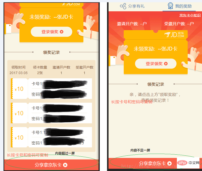
效果图:
CSS的做法
方法1:
html {
  height: 100%;
  display: table;
}

body {
  display: table-cell;
  height: 100%;
}
方法2:使用flex布局:
<p class="container">
  <header></header>
  <content></content>
  <footer></footer>
</p>
.container {
  display: flex;
  min-height: 100vh;
  flex-direction: column;
}

header {
  background: #cecece;
  min-height: 100px;
}

content {
  background: #bbbbbb;
  flex: 1; /* 1 代表盡可能最大,會自動填滿除了 header footer 以外的空間 */
}

footer {
  background: #333333;
  min-height: 100px;
}
JS的做法
css的做法有时候会在定位的时候造成一些麻烦,可以尝试使用js去动态改变html的高度
基于zepto
$(document).ready(function(){
  var windowHeight = $(window).height();
  if($(this).height() < windowHeight){
      $(this).height(windowHeight);
  }
});
原生js
window.onload = function(){
  var winHeight = 0;
  if (window.innerHeight){
    winHeight = window.innerHeight;
  }else if ((document.body) && (document.body.clientHeight)){
    winHeight = document.body.clientHeight;
  }
  var html = document.getElementsByTagName('html')[0];
  if(document.body.offsetHeight < windowHeight){
      html.style.height = windowHeight;
  }
};
以上就是css如何让高度自适应的详细内容,更多请关注php爱好者其它相关文章!
-
 atoi函数用法详解和模拟实现 时间:2025-12-25
 -
 灰度发布、金丝雀发布、蓝绿发布的详细介绍、区别以及实现方法 时间:2025-12-25
 -
 简述CISC和RISC的特点和区别 时间:2025-12-25
 -
 小波变换的定义、原理、作用和应用 时间:2025-12-25
 -
 Redis持久化RDB和AOF的区别和优缺点 时间:2025-12-25
 -
 WebService接口调用方式 WebService接口和API接口的区别 时间:2025-12-25
今日更新
-
 蛋仔派对2025乐园嘉年华现已开启 活动介绍
阅读:18
-
 蛋仔派对极速追逃怎么玩
阅读:18
-
 炉石传说头号男粉茶壶DK卡组代码是什么
阅读:18
-
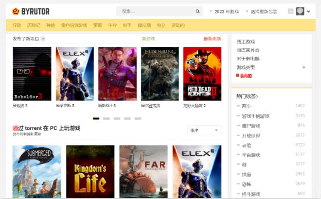 俄罗斯游戏网站byrut如何进入-俄罗斯游戏网站byrut详细进入方法教程
阅读:18
-
 杖剑传说首个主题界域12月25日开启 (内含兑换码)
阅读:18
-
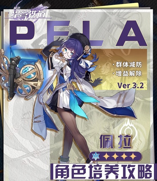 崩坏:星穹铁道佩拉角色培养攻略 佩拉配队遗器及光追推荐
阅读:18
-
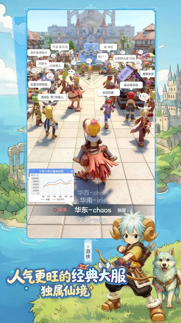 仙境传说重生初期玩法和兑换码
阅读:18
-
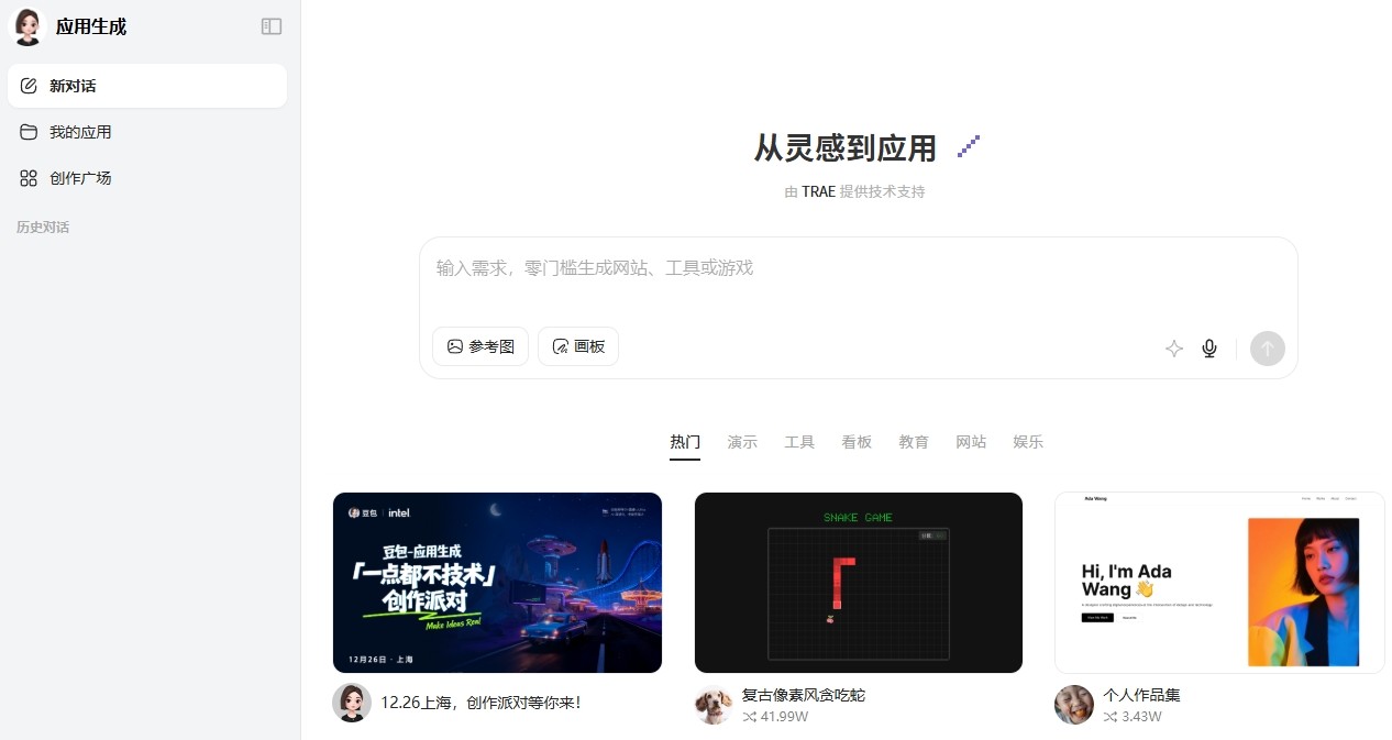 豆包网页版应用生成入口在哪-豆包AI应用生成器网页版直达入口
阅读:18
-
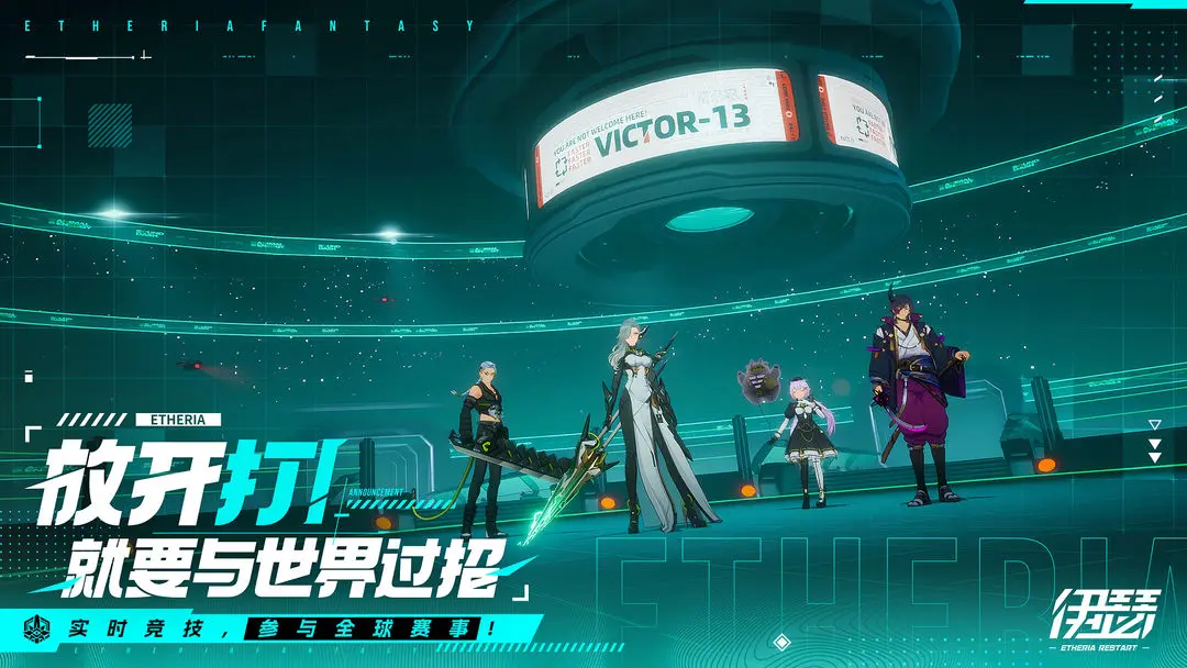 伊瑟2025最新12月可用兑换码合集分享
阅读:18
-
 原神千雪度假村派对聚奇域网页活动参与地址分享
阅读:18