<!DOCTYPE HTML PUBLIC "-//W3C//DTD XHTML 1.1//EN" "http://www.w3.org/TR/xhtml11/DTD/xhtml11.dtd"> <html xmlns="http://www.w3.org/1999/xhtml"><head> <meta http-equiv="Content-Type" content="text/html; charset=UTF-8"> <title>CSS3 - 有图有真相</title> <meta name="description" content="CSS3 - 有图有真相"> <meta http-equiv="adimage" content="200"> <style> body{ background:#fff; width:901px; margin:auto; } #doraemon{ position:fixed; margin:50px; float:left; width:500px; } #instr{ float:right; width:400px; font-size:14px; border-left:2px solid black; padding-left:20px; } #head_light{ width:50px; height:50px; transform: rotate(20deg); -webkit-transform: rotate(20deg); -moz-transform: rotate(20deg); -o-transform: rotate(20deg); box-shadow:80px 20px 50px #fff; -webkit-box-shadow:80px 20px 55px #fff; -moz-box-shadow:80px 20px 50px #fff; border-radius:45px; -webkit-border-radius:45px; -moz-border-radius:60px; position:absolute; top:-20px; left:170px; opacity:0.5 } #face{ position:relative; width:310px; height:300px; border-radius:146px; -webkit-border-radius:146px; -moz-border-radius:146px; background:#07beea; background: -webkit-gradient(linear, right top, left bottom, from(#fff) ,color-stop(0.20, #07beea), color-stop(0.73, #10a6ce),color-stop(0.95, #000), to(#444)); background: -moz-linear-gradient(right top, #fff,#07beea 20%, #10a6ce 73% ,#000 95% ,#000 155%); border:#333 2px solid; top:-15px; box-shadow:-5px 10px 15px rgba(0,0,0,0.45); -webkit-box-shadow:-5px 10px 15px rgba(0,0,0,0.45); -moz-box-shadow:-5px 10px 15px rgba(0,0,0,0.45); } #base{ position:relative; top:-5px; } #base_white{ position:absolute; border:#000 2px solid; width:264px; height:196px; border-radius: 150px 150px; -webkit-border-radius: 150px 150px; -moz-border-radius: 150px 150px; background:#FFF; background: -webkit-gradient(linear, right top, left bottom, from(#fff),color-stop(0.75,#fff),color-stop(0.83,#eee),color-stop(0.90,#999),color-stop(0.95,#444), to(#000)); background: -moz-linear-gradient(right top, #fff,#fff 75%, #eee 83%,#999 90%,#444 95%, #000); z-index:1; top:85px; left:22px; } #eyes{ position:relative; top:-5px; } div.eye{ position:absolute; border-radius: 35px 35px; -webkit-border-radius: 35px 35px; -moz-border-radius: 35px 35px; border:2px solid #000; width:72px; height:83px; z-index:20; background:#fff; } div.black_eye{ position:absolute; width:15px; height:15px; border-radius:10px; -webkit-border-radius:10px; -moz-border-radius:10px; background:#333; z-index:21; -webkit-animation-name: cate; -webkit-animation-duration: 3s; -webkit-animation-timing-function: linear; -webkit-animation-iteration-count: 200; } @-webkit-keyframes cate{ 0%{ margin:0 0 0 0; } 80% { margin:0px 0 0 0; } 85% { margin:-20px 0 0 0; } 90%{ margin:0 0 0 0; } 93%{ margin:0 0 0 7px; } 96%{ margin:0 0 0 0; } 100%{ margin:0 0 0 0; } } div.black_left{ top:100px; left:130px; } div.black_right{ top:100px; left:170px; } div.eye_left{ top:45px; left:82px; } div.eye_right{ top:45px; left:156px; } #nose{ width:32px; height:32px; border:2px solid #000; border-radius:50px; -webkit-border-radius:50px; -moz-border-radius:50px; background:#c93e00; position:absolute; top:117px; left:139px; z-index:30; } #nose_light{ width:10px; height:10px; border-radius:5px; -webkit-border-radius:5px; -moz-border-radius:5px; box-shadow:19px 8px 5px #fff; -webkit-box-shadow:19px 8px 5px #fff; -moz-box-shadow:19px 8px 5px #fff; position:relative; top:0px; left:0px; } #nose_line{ background:#000; width:4px; height:100px; top:125px; left:156px; position:absolute; } #nose_line{ background:#333; width:3px; height:100px; top:140px; left:155px; position:absolute; z-index:20; } #mouth{ width:240px; height:500px; border-bottom:3px solid #333; border-radius:120px; -webkit-border-radius:120px; -moz-border-radius:120px; position:absolute; top:-263px; left:36px; z-index:10; } #mouth_rewrite{ background:#fff; width:240px; height:90px; position:relative; top:115px; left:35px; z-index:12; border-radius:45px; -webkit-border-radius:45px; -moz-border-radius:60px; } #firefox_mouth, x:-moz-broken, x:last-of-type, x:indeterminate { position:relative; width:170px; height:150px; -moz-border-radius:85px; border:3px solid #000; background:#FFF; z-index:11; top:-3px; left:70px; } .whiskers{ background:#333; height:2px; width:60px; position:absolute; z-index:20; } .whi_right{ top:165px; left:210px; } .whi_right_top{ top:145px; left:210px; } .whi_right_bottom{ top:185px; left:210px; } .whi_left{ top:165px; left:50px; } .whi_left_top{ top:145px; left:50px; } .whi_left_bottom{ top:185px; left:50px; } .rotate20{ transform: rotate(20deg); -webkit-transform: rotate(20deg); -moz-transform: rotate(20deg); -o-transform: rotate(20deg); } .rotate160{ transform: rotate(160deg); -webkit-transform: rotate(160deg); -moz-transform: rotate(160deg); -o-transform: rotate(160deg); } #choker{ position:relative; top:-55px; left:35px; z-index:100; } #belt{ width:230px; height:20px; border:#000 solid 2px; background:#ca4100; background: -webkit-gradient(linear, left top, left bottom, from(#ca4100), to(#800400)); background: -moz-linear-gradient(top, #ca4100, #800400); border-radius:10px; -webkit-border-radius:10px; -moz-border-radius:10px; position:relative; left:5px; } #bell{ width:40px; height:40px; border-radius:50px; -webkit-border-radius:50px; -moz-border-radius:50px; border:2px solid #000; background:#f9f12a; background: -webkit-gradient(linear, left top, left bottom, from(#f9f12a),color-stop(0.5, #e9e11a), to(#a9a100)); background: -moz-linear-gradient(top, #f9f12a, #e9e11a 75%,#a9a100); box-shadow:-5px 5px 10px rgba(0,0,0,0.25); -webkit-box-shadow:-5px 3px 5px rgba(0,0,0,0.25); -moz-box-shadow:-5px 5px 10px rgba(0,0,0,0.25); position:relative; top:-15px; left:100px; } #bell_line{ width:36px; height:2px; background:#f9f12a; border:#333 solid 2px; position:relative; top:10px; } #bell_circle{ width:12px; height:10px; border-radius:5px; -webkit-border-radius:5px; -moz-border-radius:5px; background:#000; position:relative; top:14px; left:14px; } #bell_under{ width:3px; height:15px; background:#000; position:relative; top:10px; left:18px; } #bell_light{ width:10px; height:10px; border-radius:10px; -webkit-border-radius:10px; -moz-border-radius:10px; box-shadow:19px 8px 5px #fff; -webkit-box-shadow:19px 8px 5px #fff; -moz-box-shadow:19px 8px 5px #fff; position:relative; opacity:0.7; top:-35px; left:5px; } #doutai{ position:absolute; width:220px; height:165px; background:#07beea; background: -webkit-gradient(linear, right top, left top, from(#07beea),color-stop(0.5, #0073b3),color-stop(0.75,#00b0e0), to(#0096be)); background: -moz-linear-gradient(right, #07beea, #0073b3 50%,#0096be 75%,#00b0e0 ,#0096be 100% ,#333 114%); border:#333 2px solid; top:262px; left:46px; } div.base_white2{ position:absolute; width:170px; height:170px; border-radius:85px; -webkit-border-radius:85px; -moz-border-radius:85px; border:2px solid #000; background:#FFF; background: -webkit-gradient(linear, right top, left bottom, from(#fff),color-stop(0.75,#fff),color-stop(0.83,#eee),color-stop(0.90,#999),color-stop(0.95,#444), to(#000)); background: -moz-linear-gradient(right top, #fff,#fff 75%, #eee 83%,#999 90%,#444 95%, #000); } .doutai_center{ top:230px; left:72px; } #circle{ position:relative; width:130px; height:130px; border-radius:65px; -webkit-border-radius:65px; -moz-border-radius:65px; background:#fff; background: -webkit-gradient(linear, right top, left bottom, from(#fff),color-stop(0.70,#fff),color-stop(0.75,#f8f8f8),color-stop(0.80,#eee),color-stop(0.88,#ddd), to(#fff)); background: -moz-linear-gradient(right top, #fff, #fff 70%,#f8f8f8 75%,#eee 80%,#ddd 88% , #fff); border:2px solid #000; top:-120px; left:92px; } #circle_rewrite{ position:relative; width:134px; height:60px; background:#fff; border-bottom:2px solid #000; top:-250px; left:92px; } #hand_right{ position:absolute; top:272px; left:248px; width:100px; height:100px; } #arm_right{ position:relative; width:80px; height:50px; background:#07beea; background: -webkit-gradient(linear, left top, left bottom, from(#07beea),color-stop(0.85,#07beea), to(#555)); background: -moz-linear-gradient(top, #07beea, #07beea 85%, #555); border:solid 1px #000; z-index:-1; top:17px; transform: rotate(35deg); -webkit-transform: rotate(35deg); -moz-transform: rotate(35deg); -o-transform: rotate(35deg); box-shadow:-10px 7px 10px rgba(0,0,0,0.35); -webkit-box-shadow:-10px 7px 10px rgba(0,0,0,0.35); -moz-box-shadow:-10px 7px 10px rgba(0,0,0,0.35); } #hand_left{ position:absolute; top:272px; left:-46px; width:100px; height:100px; } #arm_left{ position:relative; width:80px; height:50px; background:#0096be; border:solid 1px #000; z-index:-1; top:17px; left:36px; transform: rotate(145deg); -webkit-transform: rotate(145deg); -moz-transform: rotate(145deg); -o-transform: rotate(145deg); box-shadow:5px -7px 10px rgba(0,0,0,0.25); -webkit-box-shadow:5px -7px 10px rgba(0,0,0,0.25); -moz-box-shadow:5px -7px 10px rgba(0,0,0,0.25); } div.hand_circle{ position:absolute; width:60px; height:60px; border-radius:30px; -webkit-border-radius:30px; -moz-border-radius:30px; border:2px solid #000; background:#fff; background: -webkit-gradient(linear, right top, left bottom, from(#fff),color-stop(0.5,#fff),color-stop(0.70,#eee),color-stop(0.8,#ddd), to(#999)); background: -moz-linear-gradient(right top, #fff, #fff 50%, #eee 70%, #ddd 80%,#999); } .hand_right{ top:32px; left:40px; } .arm_rewrite_right{ position:relative; width:4px; height:45px; background:#07beea; top:-51px; left:18px; } .hand_left{ top:34px; left:10px; } .arm_rewrite_left{ position:relative; width:4px; height:50px; background:#0096be; top:-52px; left:92px; } #foot{ position:relative; width:280px; height:40px; top:-141px; left:20px; } #foot_left{ width:125px; height:30px; background:#fff; background: -webkit-gradient(linear, right top, left bottom, from(#fff),color-stop(0.75,#fff),color-stop(0.85,#eee), to(#999)); background: -moz-linear-gradient(right top, #fff,#fff 75%, #eee 85%, #999); border:solid 2px #333; border-top-left-radius:80px; border-bottom-left-radius:40px; border-top-right-radius:60px; border-bottom-right-radius:60px; -webkit-border-top-left-radius:80px; -webkit-border-bottom-left-radius:40px; -webkit-border-top-right-radius:60px; -webkit-border-bottom-right-radius:60px; -moz-border-radius-topleft:80px; -moz-border-radius-bottomleft:40px; -moz-border-radius-topright:60px; -moz-border-radius-bottomright:60px; position:relative; left:8px; top:2px; box-shadow:-6px 0px 10px rgba(0,0,0,0.35); -webkit-box-shadow:-6px 0px 10px rgba(0,0,0,0.35); -moz-box-shadow:-6px 0px 10px rgba(0,0,0,0.35); z-index:-1; } #foot_right{ position:relative; width:125px; height:30px; background:#fff; background: -webkit-gradient(linear, right top, left bottom, from(#fff),color-stop(0.75,#fff),color-stop(0.85,#eee), to(#999)); background: -moz-linear-gradient(right top, #fff,#fff 75%, #eee 85%, #999); border:solid 2px #333; border-top-left-radius:60px; border-bottom-left-radius:60px; border-top-right-radius:80px; border-bottom-right-radius:40px; -webkit-border-top-left-radius:60px; -webkit-border-bottom-left-radius:60px; -webkit-border-top-right-radius:80px; -webkit-border-bottom-right-radius:40px; -moz-border-radius-topleft:60px; -moz-border-radius-bottomleft:60px; -moz-border-radius-topright:80px; -moz-border-radius-bottomright:40px; top:-32px; left:141px; box-shadow:-6px 0px 10px rgba(0,0,0,0.35); -webkit-box-shadow:-6px 0px 10px rgba(0,0,0,0.35); -moz-box-shadow:-6px 0px 10px rgba(0,0,0,0.35); z-index:-1; } #foot_rewrite{ position:relative; width:20px; height:10px; background:#fff; background: -webkit-gradient(linear, right top, left bottom, from(#666),color-stop(0.83,#fff), to(#fff)); background: -moz-linear-gradient(right top, #666, #fff 83%, #fff); top:-76px; left:127px; border-top:2px solid #000; border-right:2px solid #000; border-left:2px solid #000; border-top-right-radius:40px; border-top-left-radius:40px; -webkit-border-top-right-radius:40px; -webkit-border-top-left-radius:40px; -moz-border-radius-topleft:40px; -moz-border-radius-topright:40px; } #shadow_doutai_left{ width:30px; height:200px; box-shadow:-10px 10px 15px rgba(0,0,0,0.45); -webkit-box-shadow:-10px 10px 15px rgba(0,0,0,0.45); -moz-box-shadow:-10px 10px 15px rgba(0,0,0,0.45); position:absolute; top:250px; left:46px; z-index:-10; } #shadow_doutai_right{ width:30px; height:200px; box-shadow:10px 10px 15px rgba(0,0,0,0.35); -webkit-box-shadow:10px 10px 25px rgba(0,0,0,0.35); -moz-box-shadow:10px 10px 15px rgba(0,0,0,0.35); position:absolute; top:240px; left:230px; z-index:-10; } #shadow_doutai_arm{ width:85px; height:165px; box-shadow:-100px 10px 15px rgba(0,0,0,0.0); -webkit-box-shadow:-100px 10px 15px rgba(0,0,0,0.25); -moz-box-shadow:-100px 10px 15px rgba(0,0,0,0.25); position:absolute; top:230px; left:113px; z-index:10; opacity:0.5; transform: rotate(-20deg); -webkit-transform: rotate(-20deg); -moz-transform: rotate(-20deg); -o-transform: rotate(-20deg); border-bottom-left-radius:40px; -webkit-border-bottom-left-radius:40px; -moz-border-radius-bottomleft:40px; border-top-left-radius:20px; -webkit-border-top-left-radius:20px; -moz-border-radius-topleft:20px; } #shadow_belt{ width:40px; height:30px; box-shadow:-100px 10px 15px rgba(0,0,0,0); -webkit-box-shadow:-100px 10px 15px rgba(0,0,0,0.25); -moz-box-shadow:-100px 10px 15px rgba(0,0,0,0.25); position:absolute; top:240px; left:130px; z-index:10; border-bottom-left-radius:40px; -webkit-border-bottom-left-radius:40px; -moz-border-radius-bottomleft:40px; z-index:300; } #arm_left:not(\*|*), .arm_rewrite_left:not(\*|*){ background:#07beea; } #arm_left, .arm_rewrite_left{ background:#07beea\9; *background:#07beea; _background:#07beea; } #kiji{ position:relative; top:-150px; } </style> </head> <body> <div id="doraemon"> <div id="face"> <div id="head_light"></div> <div id="eyes"> <div class="eye eye_left"></div> <div class="black_eye black_left"></div> <div class="eye eye_right"></div> <div class="black_eye black_right"></div> </div> <div id="base"> <div id="base_white"></div> <div id="nose"> <div id="nose_light"></div> </div> <div id="nose_line"></div> <div id="mouth"></div> <div id="mouth_rewrite"></div> <div id="firefox_mouth"></div> <div class="whiskers whi_right_top rotate160"></div> <div class="whiskers whi_right"></div> <div class="whiskers whi_right_bottom rotate20"></div> <div class="whiskers whi_left_top rotate20"></div> <div class="whiskers whi_left"></div> <div class="whiskers whi_left_bottom rotate160"></div> </div> </div> <div id="choker"> <div id="belt"></div> <div id="bell"> <div id="bell_line"></div> <div id="bell_circle"></div> <div id="bell_under"></div> <div id="bell_light"></div> </div> </div> <div id="body"> <div id="doutai"></div> <div class="base_white2 doutai_center"></div> <div id="pocket"> <div id="circle"></div> <div id="circle_rewrite"></div> </div> </div> <div id="hand_right"> <div id="arm_right"></div> <div class="hand_circle hand_right"></div> <div class="arm_rewrite_right"></div> </div> <div id="hand_left"> <div id="arm_left"></div> <div class="hand_circle hand_left"></div> <div class="arm_rewrite_left"></div> </div> <div id="foot"> <div id="foot_left"></div> <div id="foot_right"></div> <div id="foot_rewrite"></div> </div> <div id="shadow_doutai_arm"></div> <div id="shadow_doutai_left"></div> <div id="shadow_doutai_right"></div> <div id="shadow_belt"></div> </div> </body> </html>
提示:您可以先修改部分代码再运行
测试各个浏览器对CSS3的解释效果,上边的“图像”并非图片,而是纯CSS。目前各个浏览器对CSS3的支持效果不一样,其中IE系的浏览器支持效果最差。
[ 本帖最后由 cloudgamer 于 2010-5-22 14:05 编辑 ]

 这个蛮有意思的~
 am.gif (21.12 KB)
 这哥们有点意思
 office 2019专业增强版最新2021版激活秘钥/序列号/激活码推荐 附激活工具
 如何安装mysql8.0
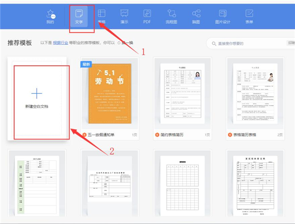 Word快速设置标题样式步骤详解
 20+道必知必会的Vue面试题(附答案解析)
 HTML如何制作表单
 百词斩可以改天数吗?当然可以,4个步骤轻松修改天数!
 ET文件格式和XLS格式文件之间如何转化?
 react和vue的区别及优缺点是什么
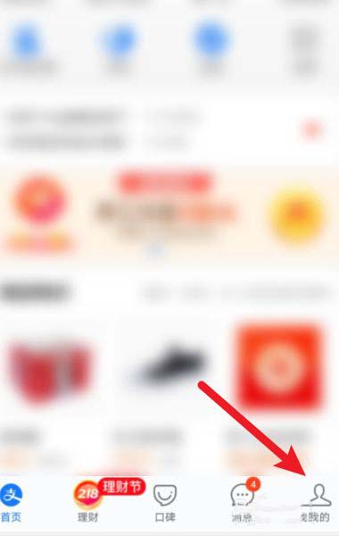 支付宝人脸识别如何关闭?
 腾讯微云怎么修改照片或视频备份路径?