要求 :1.宽度用百分比布局
2.适应所有屏幕大小
3.不能用js
4.当窗口缩放时,不错位.不变形
作者: alize
发布时间: 2008-06-27
<head> <title>ceshi</title> <style type="text/css"> #left,#right{width:10%;float:left;border:1px solid #999;} #right{width:80%;} </style> </head> <body> <div id="left">sakdssa</div> <div id="right">asjadjdjuuu43243234</div> </body>
提示:您可以先修改部分代码再运行
[ 本帖最后由 alize 于 2008-6-27 11:18 编辑 ]
作者: alize
发布时间: 2008-06-27
单纯用css这样的布局很是麻烦.
作者: chenjmdgjl
发布时间: 2008-06-27
的确..我试着写了几个..都不行...期待高手实现这个效果
作者: alize
发布时间: 2008-06-27
好像css 不能直接实现..只能用js来实现了.
作者: alize
发布时间: 2008-06-27
百分比對於布局來說,是很好實現的東西,怎麼會不能實現呢,有可能是你的思路不正確。
作者: k236740
发布时间: 2008-06-27
<table width="100%" cellspacing=0> <tr><td colspan=2 align=center bgColor=whitesmoke>header</td></tr> <tr><td width="20%" align=center bgColor=gray height=100px>left</td> <td align=center>right</td></tr> <tr><td colspan=2 align=center bgColor=whitesmoke>footer</td></tr> </table>
提示:您可以先修改部分代码再运行
作者: chensulong
发布时间: 2008-06-27

不知道LZ是要实现什么效果?
作者: snowshade
发布时间: 2008-06-27
提供三種基礎的欄位編排方式給你做個參考。
百分比布局 - 預設排列方式 ( 按原始代碼結構 ):
<!DOCTYPE html PUBLIC "-//W3C//DTD XHTML 1.0 Transitional//EN" "http://www.w3.org/TR/xhtml1/DTD/xhtml1-transitional.dtd"> <html xmlns="http://www.w3.org/1999/xhtml" xml:lang="zh-TW" lang="zh-TW"> <head> <title>百分比布局 - 預設排列方式 ( 按原始代碼結構 )</title> <meta http-equiv="Content-Type" content="text/html; charset=big5" /> <meta http-equiv="Content-Language" content="zh-TW" /> <style type="text/css"> /* 元素復位 */ html,body,h3 {margin:0;padding:0;border :0;} /* 垂直居中 */ #wrapper { position:absolute; top:50%; margin-top:-150px; } /* 包裝盒子。用百分比來表示包裝的盒子 */ #wrapper {width:100%;height:300px;background:#E6EFC2;border-top : 4px solid #C6D880; border-bottom : 4px solid #C6D880; } #wrapper h3 {text-align:center; line-height : 250px; } #wrapper #footer h3 {text-align:center; line-height : 50px; } #sidebar h3 { height:250px; border-width :0 1px; border-style : dashed; border-color : #afafaf; } /* 利用子系選擇符宣告所有的子對象「div」向左浮動 */ #wrapper div {float : left;} /* 各元素細節 */ #content {width:50%;height:250px;background:#FFF9F2;} #sidebar {width:25%;height:250px;background:#E0E2F9;} #secondary {width:25%;height:250px;background:#F9E0F4;} /* 頁腳 */ #footer {width:100%;height:50px;background:#6C9906;clear :both;} </style> </head> <body> <div id="wrapper"> <div id="content"><h3>#content</h3></div> <div id="sidebar"><h3>#sidebar</h3></div> <div id="secondary"><h3>#secondary</h3></div> <div id="footer"><h3>#footer</h3></div> </div> </body> </html>
提示:您可以先修改部分代码再运行
百分比布局 - 倒序的排列:
<!DOCTYPE html PUBLIC "-//W3C//DTD XHTML 1.0 Transitional//EN" "http://www.w3.org/TR/xhtml1/DTD/xhtml1-transitional.dtd"> <html xmlns="http://www.w3.org/1999/xhtml" xml:lang="zh-TW" lang="zh-TW"> <head> <title>百分比布局 - 倒序的排列</title> <meta http-equiv="Content-Type" content="text/html; charset=big5" /> <meta http-equiv="Content-Language" content="zh-TW" /> <style type="text/css"> /* 元素復位 */ html,body,h3 {margin:0;padding:0;border :0;} /* 垂直居中 */ #wrapper { position:absolute; top:50%; margin-top:-150px; } /* 包裝盒子。用百分比來表示包裝的盒子 */ #wrapper {width:100%;height:300px;background:#E6EFC2;border-top : 4px solid #C6D880; border-bottom : 4px solid #C6D880; } #wrapper h3 {text-align:center; line-height : 250px; } #wrapper #footer h3 {text-align:center; line-height : 50px; } #sidebar h3 { height:250px; border-width :0 1px; border-style : dashed; border-color : #afafaf; } /* 利用子系選擇符宣告所有的子對象「div」向左浮動 */ #wrapper div {float : right;} /* 各元素細節 */ #content {width:50%;height:250px;background:#FFF9F2;} #sidebar {width:25%;height:250px;background:#E0E2F9;} #secondary {width:25%;height:250px;background:#F9E0F4;} /* 頁腳 */ #footer {width:100%;height:50px;background:#6C9906;clear :both;} </style> </head> <body> <div id="wrapper"> <div id="content"><h3>#content</h3></div> <div id="sidebar"><h3>#sidebar</h3></div> <div id="secondary"><h3>#secondary</h3></div> <div id="footer"><h3>#footer</h3></div> </div> </body> </html>
提示:您可以先修改部分代码再运行
百分比布局 - 側欄位居兩邊:
<!DOCTYPE html PUBLIC "-//W3C//DTD XHTML 1.0 Transitional//EN" "http://www.w3.org/TR/xhtml1/DTD/xhtml1-transitional.dtd"> <html xmlns="http://www.w3.org/1999/xhtml" xml:lang="zh-TW" lang="zh-TW"> <head> <title>百分比布局 - 側欄位居兩邊</title> <meta http-equiv="Content-Type" content="text/html; charset=big5" /> <meta http-equiv="Content-Language" content="zh-TW" /> <style type="text/css"> /* 元素復位 */ html,body,h3 {margin:0;padding:0;border :0;} /* 垂直居中 */ #wrapper { position:absolute; top:50%; width:100%;margin-top:-150px; } /* 包裝盒子。用百分比來表示包裝的盒子 */ #wrapper {width:100%;height:300px;background:#E6EFC2;border-top : 4px solid #C6D880; border-bottom : 4px solid #C6D880; } #wrapper h3 {text-align:center; line-height : 250px; } #wrapper #footer h3 {text-align:center; line-height : 50px; } #content h3 { height:250px; border-width :0 1px; border-style : dashed; border-color : #afafaf; } /* 各元素細節 */ #content { height:250px;background:#FFF9F2;} #sidebar {height:250px;background:#E0E2F9;} #secondary { height:250px;background:#F9E0F4;} /* 欄位排列 */ #content { float : left; width:50%;margin:0 25%;} #sidebar { float : left; width:25%;margin-left:-100%;} #secondary { float : left; width:25%;margin-left:-25%;} /* 頁腳 */ #footer {width:100%;height:50px;background:#6C9906;clear :both;} </style> <!--[if IE 6]> <style type="text/css"> #main { width:100%; margin-left:-25%; /* ie6的雙倍邊距BUG */ } #content { width:49.9%; /* ie6窗口縮放時,有0.1%的誤差 */ } </style> <![endif]--> </head> <body> <div id="wrapper"> <div id="main"> <div id="content"><h3>#content</h3></div> <div id="sidebar"><h3>#sidebar</h3></div> <div id="secondary"><h3>#secondary</h3></div> </div> <div id="footer"><h3>#footer</h3></div> </div> </body> </html>
提示:您可以先修改部分代码再运行
作者: k236740
发布时间: 2008-06-27
很明显,你的前两个解决方案全部错位了。请看楼主第4条要求。
[ 本帖最后由 chensulong 于 2008-6-27 17:16 编辑 ]
作者: chensulong
发布时间: 2008-06-27
第一次錯位.
但你再resize窗口就好了,ie6有點怪.
作者: younger888
发布时间: 2008-06-27
其实百分比最难的是控制栏目之间的 gutters 。其他就不怎么难了。布局和大家所想的一样。至于如何控制 guuters 。有这点方法,以设置 margin-right 为例吧。
(1)简单不要求固定的数值:
这时可以设置 margin-right 为一个百分比。使得 width + margin-right 等于这个栏目的宽度,比如:#content 要在右边实现 gutters 。就可以这样设置:
复制内容到剪贴板
代码:
......
#content { width: 65%; margin-right: 5%; }
......
(2)要求一个固定的数值:
这个时候直接定义在对象上的 margin 是很难控制的。所以我们可以加个额外的 <div> 来实现,结构是:
复制内容到剪贴板
代码:
......
<div id="content">
<div><p> content is here </p></div>
</div>
.......
然后在里面的 <div> 定义 margin-right 就不会影响到外面的宽度。比如这样:
复制内容到剪贴板
代码:
.....
#content { width: 70%;}
#content div { margin-right: 5px; }
.....
大概就是这样了,临时想的。其他情况可以参考。
作者: majer
发布时间: 2008-06-27
我該說你死腦筋還是你不懂得怎麼看代碼。
ie6對於百分比的計算往往會有0.1%誤差,既然你都說錯位了,相關的屬性值改一下不就好了。
第三個方案我已經給了例子,第一跟第二之所以故意留下那個bug就是希望大夥們能多用點腦筋。
作者: k236740
发布时间: 2008-06-27
關於第一跟第二的解決方案中有錯位的現象:
复制内容到剪贴板
代码:
* html #content {
width:49.9%;
}
其中的#content可以換成#sidebar或#secondary,即可解決。
作者: k236740
发布时间: 2008-06-27
楼上写的的效果不错!
另外,一般的页面设计根本不需要百分比的布局的!
呵呵!
作者: fonqing
发布时间: 2008-06-27
引用:
原帖由 k236740 于 2008-6-27 20:07 发表
我該說你死腦筋還是你不懂得怎麼看代碼。
ie6對於百分比的計算往往會有0.1%誤差,既然你都說錯位了,相關的屬性值改一下不就好了。
第三個方案我已經給了例子,第一跟第二之所以故意留下那個bug就是希望大夥們能多 ...
不好意思,我懂怎么看代码,但是我没看你的代码。
BTW:我说的并没有错,你前两个确实在IE下是错位的。
[ 本帖最后由 chensulong 于 2008-6-27 21:21 编辑 ]
作者: chensulong
发布时间: 2008-06-27
哈哈....我以前写过百分比的,在ie6下和ie7下问题明显,看看有没有高手
作者: 4511916
发布时间: 2008-06-27
最后一个IE6下选择文字的时候会有奇怪的问题,有解决办法吗?
作者: tudou527
发布时间: 2008-06-27
不知道楼主什么意思?
百分比布局, 使用table的话,简单。
div+css 方式也很简单。 (几列都使用百分比)
我想,楼主,可以是需要,一列定宽, 而,有一列,自动拉宽的。
作者: 枫知秋
发布时间: 2008-06-28
侧栏定宽。主体内容自动拉宽(算不算百分比啊?)
跟据这个代码,很简单实现这样的布局。(只要将float改下就行了)
侧 主 侧
侧 侧 主
主 侧 侧
侧 主
主 侧
以下代码使用 xhtml 1.1 标准
IE6, Firefox2, Opera9, Safari3 下测试通过
(IE7没装,没测试,估计也没问题)
<!DOCTYPE html PUBLIC "-//W3C//DTD XHTML 1.1//EN" "http://www.w3.org/TR/xhtml11/DTD/xhtml11.dtd"> <html xmlns="http://www.w3.org/1999/xhtml"> <head> <meta http-equiv="Content-Type" content="text/html; charset=utf-8" /> <title>百分比布局 by 枫知秋</title> <style> body { margin:0; padding:0; font-size:12px; line-height:20px; } .container { margin-top:10px; padding:10px; } .clear { clear:both; } .left { float:left; width:220px; border:solid 1px #3C8FE3; } .right { float:right; width:220px; border:solid 1px #3C8FE3; } .center { margin:0 230px 0 230px; border:solid 1px #3C8FE3; } .side { float:left; width:220px; border:solid 1px #3C8FE3; } .main { margin-left:230px; border:solid 1px #3C8FE3; } table tr { border:solid 1px #3C8FE3; } </style> </head> <body> <div class="container"> <div class="left">DIV:左边</div> <div class="right">DIV:右边</div> <div class="center">DIV:中间</div> <div class="clear"></div> </div> <div class="container"> <div class="side">DIV:侧边</div> <div class="main">DIV:主体</div> <div class="clear"></div> </div> <div class="container"> <table width="100%" border="1"><!-- 注意定100%宽度 --> <tr> <td style="width:220px;">表格:左边</td> <td>表格:中间</td> <td style="width:220px;">表格:右边</td> </tr> </table> </div> <div class="container"> <table width="100%" border="1"><!-- 注意定100%宽度 --> <tr> <td style="width:220px;">表格:左边</td> <td>表格:主体</td> </tr> </table> </div> </body> </html>
提示:您可以先修改部分代码再运行
[ 本帖最后由 枫知秋 于 2008-6-28 00:42 编辑 ]
作者: 枫知秋
发布时间: 2008-06-28
引用:
原帖由 alize 于 2008-6-27 10:46 发表
要求 :1.宽度用百分比布局
2.适应所有屏幕大小
3.不能用js
4.当窗口缩放时,不错位.不变形
我给个例子,你可以参考一下。
最窄770px最宽1024px经典布局
<!DOCTYPE html PUBLIC "-//W3C//DTD XHTML 1.0 Transitional//EN" "http://www.w3.org/TR/xhtml1/DTD/xhtml1-transitional.dtd"> <html xmlns="http://www.w3.org/1999/xhtml"> <head> <title>最窄770px最宽1024px的经典布局</title> <meta http-equiv="Content-Type" content="text/html; charset=utf-8" /> <style type="text/css"> * { margin:0; padding:0;} body { padding:10px 0 0 0; color:#000; background:#fff; text-align:center;} #wrapper{ width:auto; border:1px solid #000; min-width:770px; max-width:1024px; text-align:left; margin-left:auto; margin-right:auto; position:relative;} #outer{ margin-left:130px; margin-right:130px; background:silver; border-left:1px solid #000; border-right:1px solid #000; color: #000;} #header{ position:absolute; top:0; left:0; width:100%; height:70px; line-height:70px; border-bottom:1px solid #000; overflow:hidden; background:#0ff; text-align:center; font-size:xx-large} #left { position:relative;/*ie needs this to show float */ width:130px;float:left;left:-1px; margin-left:-129px;/*must be 1px less than width otherwise won't push footer down */ } * html #left { margin-right:-3px;}/* 3px jog*/ * html #outer{/* 3px jog*/ margin-left:181px; margin-right:30px;} p { margin-bottom:1em; padding:0 5px} #right { position:relative;/*ie needs this to show float */ width:130px; float:right; left:1px; margin-right:-129px;/*must be 1px less than width otherwise won't push footer down */ } * html #right { margin-right:-130px; margin-left:-3px}/* stop float drop in ie + 3px jog */ #footer { width:100%; clear:both; line-height:50px; border-top:1px solid #000; background:#ffc; color:#000; text-align:center; position:relative;} #clearheader{ height:72px;}/*needed to make room for header*/ #centrecontent { float:right; width:100%; position:relative;} html>body #centrecontent { margin:0 -0.5%}/*moz needs this*/ .outerwrap { float:left; width:99%;} .clearer{ height:1px; overflow:hidden; margin-top:-1px; clear:both;} /* mac hide\*/ * html #outer, * html #wrapper,* html #centrecontent { height:1%} /* end hide */ </style> <!--[if gte IE 5]> <style type="text/css"> body {width:expression( documentElement.clientWidth < 770 ? (documentElement.clientWidth == 0 ? (body.clientWidth < 770 ? "770" : "auto") : "770px") : "auto" );} #wrapper {width:expression( documentElement.clientWidth > 1024 ? (documentElement.clientWidth == 0 ? (body.clientWidth >1024 ? "1024" : "auto") : "1024px") : "auto" );} </style> <![endif]--> </head> <body> <div id="wrapper"> <div id="outer"> <div id="clearheader"></div> <div class="outerwrap"> <div id="centrecontent"> <h1>Min width of 770px and max width of 1024px</h1> <p>centre content goes here centre content goes here : centre content goes here centre content goes here : centre content goes here centre content goes here : centre content goes here centre content goes here : centre content goes here centre content goes here : centre content goes here centre content goes here : centre content goes here centre content goes here : centre content goes here centre content goes here : centre content goes here centre content goes here : centre content goes here centre content goes here : centre content goes here centre content goes here : centre content goes here centre content goes here : centre content goes here centre content goes here : centre content goes here centre content goes here : centre content goes here centre content goes here : centre content goes here centre content goes here : centre content goes here centre content goes here : centre content goes here centre content goes here : centre content goes here centre content goes here : centre content goes here content goes here : </p> </div> <div id="left"> <p>Left content goes here : Left content goes here : Left content goes here : Left content goes here : Left content goes here : Left content goes goes here : Left content goes here : </p> </div> <div class="clearer"></div> </div> <!--end outer wrap --> <div id="right"> <p>Start Right content goes here : Right content goes here : Right content goes here : Right content goes here : Right content goes here : Right content goes here : Right content goes here : Right content goes here : Right content goes here : </p> </div> <div class="clearer"></div> </div> <div id="footer">Footer - | - Footer </div> <div id="header">Header </div> </div> </body> </html>
提示:您可以先修改部分代码再运行
作者: chenjmdgjl
发布时间: 2008-07-02
我的意思是.不管几列,每一列的宽度都是百分比来布局(div,不能用表格)
在浏览器缩放时,不能有错位,比如:最后一个容器跑到下面去了..
不能用js代码来控制.
因为要考虑到兼容所有的分辨率的问题..所以每一个容器都是百分比布局.最重要的一点是不能在窗口缩放的时候出现错位的问题
作者: alize
发布时间: 2008-07-02
引用:
原帖由 chenjmdgjl 于 2008-7-2 11:03 发表
我给个例子,你可以参考一下。
最窄770px最宽1024px经典布局
[html]
最窄770px最宽1024px的经典布局
* { margin:0; padding:0;}
body { padding:10px 0 0 0; color:#000; background:# ...
你这个是设置最大和最小宽度.
作者: alize
发布时间: 2008-07-03
不对啊,楼主
你的问题我觉得就矛盾
要求 :1.宽度用百分比布局
2.适应所有屏幕大小
3.不能用js
4.当窗口缩放时,不错位.不变形 ]
能适应屏幕大小,缩放就肯定会变形的!
不可能既能适应屏幕大小,缩放还不变形的!
作者: shohoku2222
发布时间: 2008-07-03
引用:
原帖由 枫知秋 于 2008-6-28 00:32 发表
侧栏定宽。主体内容自动拉宽(算不算百分比啊?)
跟据这个代码,很简单实现这样的布局。(只要将float改下就行了)
侧 主 侧
侧 侧 主
主 侧 侧
侧 主
主 侧
以下代码使用 xhtml 1.1 标准
IE6, Fire ...
阁下这个 main 的内容多的时候就会出现问题...上面会空一部分...
作者: alize
发布时间: 2008-07-03
引用:
原帖由 alize 于 2008-7-3 11:19 发表
阁下这个 main 的内容多的时候就会出现问题...上面会空一部分...
内容多不会出问题~~~ 一直被这个问题烦~~~
会空出是因为:只要在自动拉宽的列,出现有 clear:both; , 就会撑出空间来,(side有多高,就会撑多高)
等候解决`~~
作者: 枫知秋
发布时间: 2008-07-04
楼上写的效果不错。学习了
作者: ruanfan
发布时间: 2008-07-04
扯淡的问题.你只考虑结构不考虑内容的吗
有个有宽度的图片就能让你写的不错位结构一缩放就错位
你能让图片内容跟着你标签变小吗
作者: liuxingxing
发布时间: 2008-07-04
这个问题跟本不可能实现...,一般要实现你这样的功能,至少应该固定一个层的宽度,而另一个用百分比.
作者: nantangcun
发布时间: 2008-07-04
赞成楼上的,我前段时间也写了个的
我的分左右结构,左边的宽度是固定好的。
作者: irencerong
发布时间: 2008-07-04
台湾同胞写的这段代码?
/* 垂直居中 */
#wrapper { position:absolute; top:50%; margin-top:-150px; }
这个为什么margin-top:150px;呢?
其他的ok吗?
作者: sarsls
发布时间: 2008-07-05
CSS+Div貌似简单,其实很深。越学越多问题。
作者: acoolboy
发布时间: 2008-07-05
看了,学习了,想了,提高了!
作者: c78702505
发布时间: 2008-07-05
楼主的问题,本身就有问题, 只管结构?,不管内容?,浏览器?
那不要CSS,就可以办到,table
作者: a7262619
发布时间: 2008-07-05
好,帮了我大忙!要不然就要通宵加班了!
作者: hautbbs
发布时间: 2011-09-30

 office 2019专业增强版最新2021版激活秘钥/序列号/激活码推荐 附激活工具
 如何安装mysql8.0
 Word快速设置标题样式步骤详解
 20+道必知必会的Vue面试题(附答案解析)
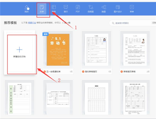
 HTML如何制作表单
 百词斩可以改天数吗?当然可以,4个步骤轻松修改天数!
 ET文件格式和XLS格式文件之间如何转化?
 react和vue的区别及优缺点是什么
 支付宝人脸识别如何关闭?
 腾讯微云怎么修改照片或视频备份路径?